It's been a long time coming, but I finally got a chance to upload it!


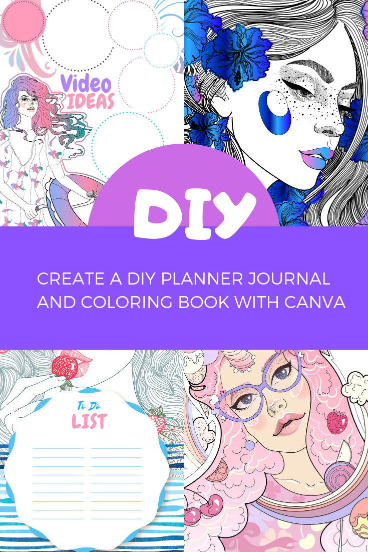
In this video I show you guys how I create a few of my coloring journal pages using canva. I have been creating, and ordering prints of my custom planner journals using blurb and canva for a while now, and thought I could share a bit of my process.

This is more so  a brief overview of what I do rather than an in depth tutorial.

I mostly use PNG images with transparent backgrounds so that I don't  have an issue combining multiple images.

I converted all the illustrations from vectors to PNG ahead of time.

Most of the wonderful images of the cute girl drawings are from Adobe Stock, but I also edited them myself so the original images won't exactly look like the ones I edited in the video, but the look will still be somewhat similar.

https://stock.adobe.com/

https://Freepik.com


Some images that I used in the video that I can provide for free:

https://gumroad.com/l/oxiTZ

Thanks for watching. I hope you were inspired to create your own journal.


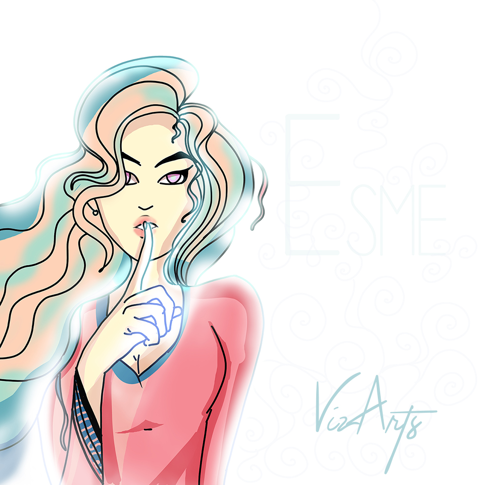
I was inspired to create this illustration when I stumbled upon a caricature cartoon on google images. I thought why not make my own version? The proportions of the hands are a bit off, but that won't stop me from posting it :)

I used adobe photoshop, and an XP-PEN tablet by the way.
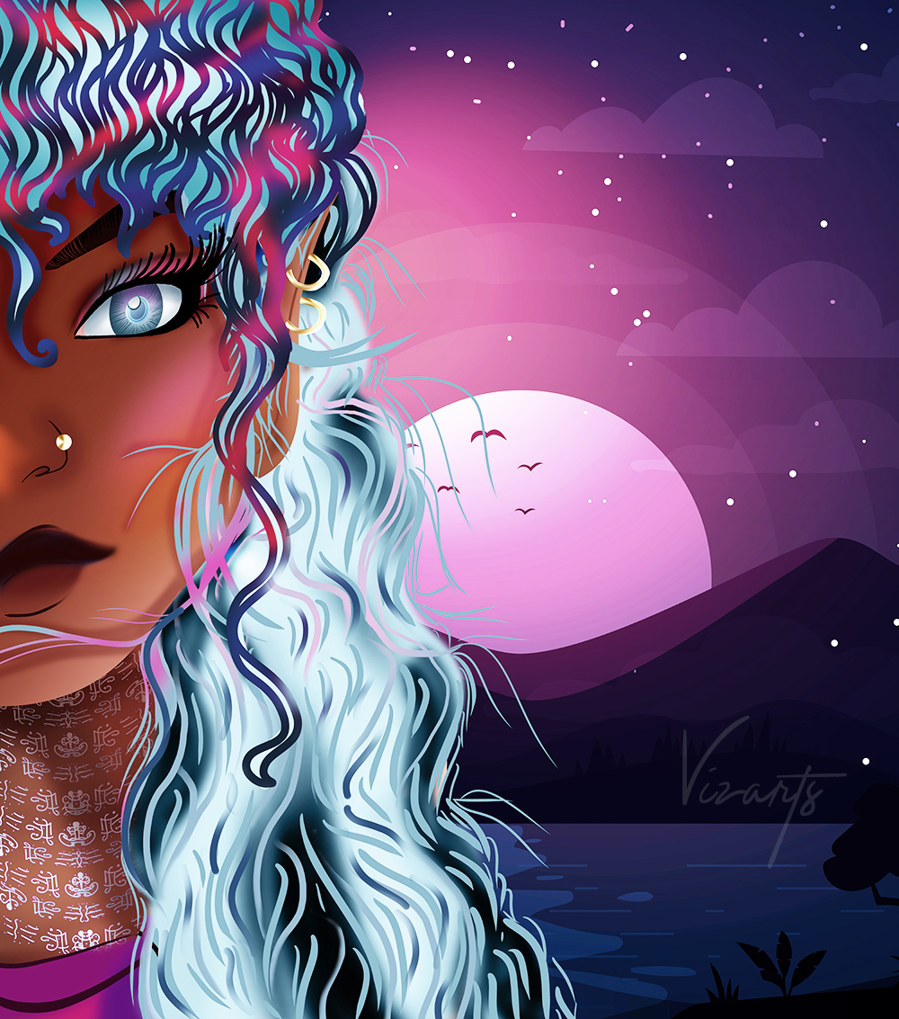
Visualartzi Reya Elvin Girls pretty anime girl digital painting fantasy illustration, 2d digital art photoshop digital painting, african american, black women beautiful anime, webtoon, webcomic

Today, I updated Reya from the Elvin Girls, and here she is so far.


Alright, so today I wanted to get a little bit creative, and take a break from drawing so I went back to manipulating photos in Photoshop. In the video below I have a quick breakdown of how I created this ebook cover design along with a few tips.


While creating this video my computer shut off, and I had to do it all over again so excuse some of the sloppiness. I was so irritated, but the results were close enough to the original so I uploaded it anyways.

Meanwhile here are a few more book cover design tips:


  • Make your cover a bit more unique when using stock images by combining 3 or more images.That way when you go to amazon you won't be competing with another book that has the exact same book cover (if you only use one generic stock image this is bound to happen. You can google the horror stories of using only one stock image, but if you don't care you can ignore this advice).  
  • While designing your book cover periodically save it, and view it as a small thumbnail. Then ask yourself..."Would I click on this book while browsing amazon or ibooks? Does anything stand out? Does it entice me to click on it, and see more?" If it doesn't catch your attention as a small thumbnail it will most likely not catch anyone else's attention. 
  • Get feedback, and honesty from your friends or family. Do not let them know you designed it (if you do they'll spare your feelings since they care about you, and your emotions. You want their honesty not their praise). Just ask what they think about the book cover. Would they be willing to buy solely based on the cover itself? Why or why not? 
  • Use that feedback to improve when designing book covers. 


A few hours ago I created an illustration for my bullet journal’s July theme.

Quick Preview of What's to come!


So here's what has been going on lately with the slow posting:


  • I dropped my Huion pen, and it stopped working. I looked for a new Huion Pen at amazon, but it was the same price as the entire Huion tablet so,
  • I bought a new tablet a few days ago. I am now a happy customer of "XP-PEN", and I am enjoying that so much more (no hate Huion). 
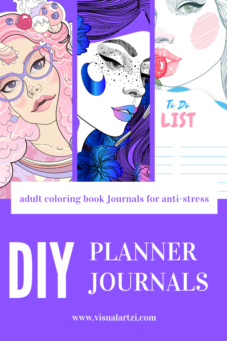
  • I am working on a brand new video tutorial all about "Anti-Stress," journaling, and coloring (preview above) so stay tuned
  • If you're wondering about the fate of "Lolitups" don't. I am posting the latest chapter up very soon, but the biggest time consumer of making this webcomic is color. It's either color (more dynamic, and longer posting times) or black and white unedited sketches (faster posting, but more plain, and messy). I am also making this a lengthy chapter!
  • I have a new job now so...I'll be polishing my schedule to post a bit more often (1-2 times per week), and sleeping more so I won't give out half-hearted posts.
That's basically it...for now. 


This a traditional illustration I created with one green sharpie maker yesterday.

I titled this "Those of us still hanging on by a thread." 

Every  single abstract item in this piece are being held on to by a string or thread whereas everything not being held on to (the fallen like dots) are those of us who have already given up, and lost the will to keep on fighting. We let go of that thread.


This is the same exact illustration, but filtered to a different color since I like blue tones :)