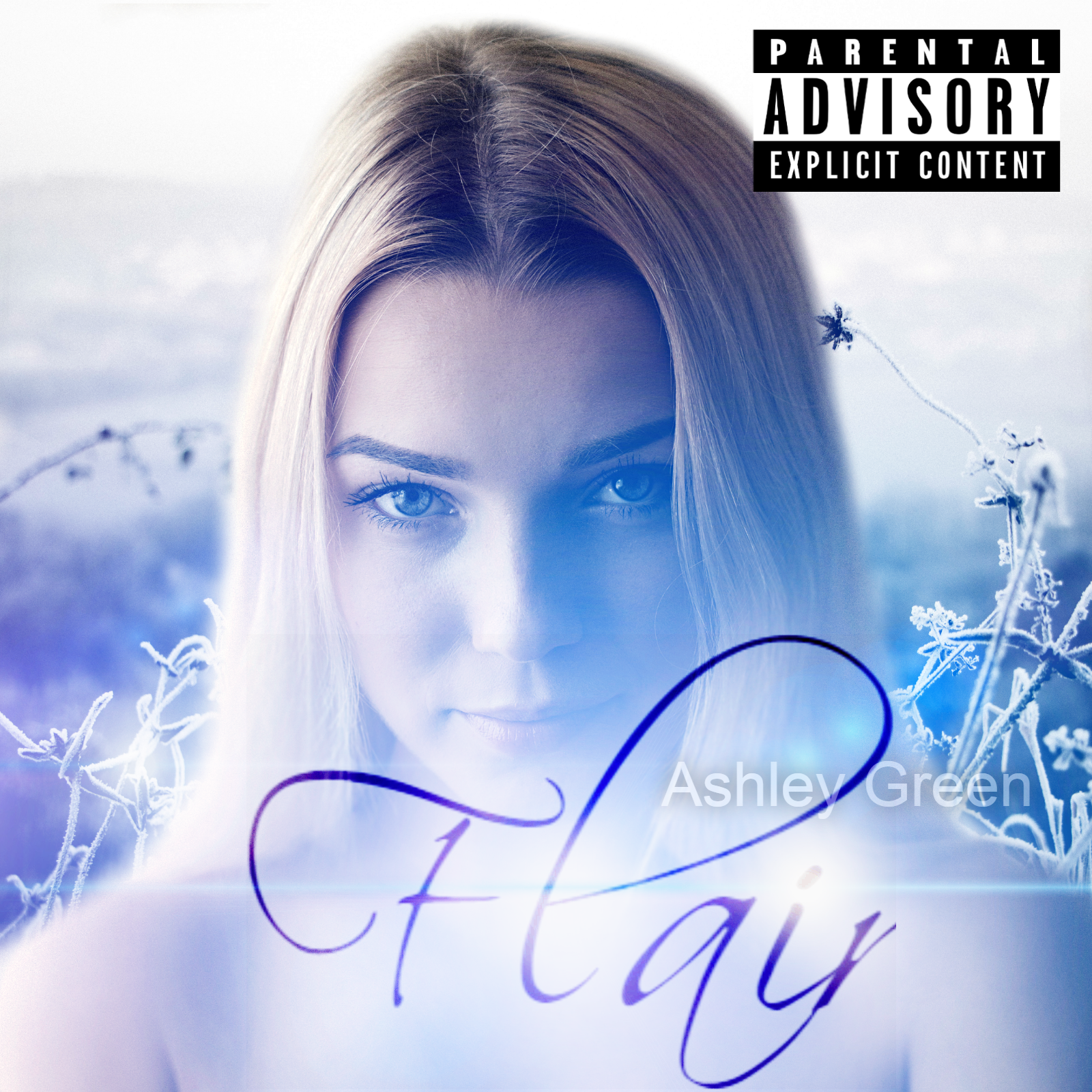
Click the video tutorial to watch how to create this album cover design. Continue reading for quick tips on creating different types of album cover designs.
The following is required to follow along with this tutorial:
- Stable Internet Connection (if it lags, drops, or is extremely slow you will have some issues).
- We are using Pixlr editor
These are the images I used in the tutorial above. Feel free to use your own images, and fonts as well. I also included the Pixlr source file:
You can download the fonts used from here:
For the title - Scriptina
For the artist name - Any "Sans Serif" font you like will do.
 |
PERFECT SQUARES |
First off album covers are always perfect squares (ex: 500 x 500, 1000 x 1000, etc... you pretty much get the picture). Before you start designing make sure to get the correct sizing for the platform you will be creating an album cover for. A few examples are listed below.
Itunes has a minimum album artwork size of 1400x1400 pixels, and a maximum of 3000 x 3000 pixels.
Soundcloud requires a minimum of 800 x 800 pixels,
I use 1600 x 1600 pixels just to stay on the safer side of minimums, and not have to worry that much about resizing.
Since we're designing a digital album cover for web (not for print) we'll be working in 72 pixels. This is only good for the web (online only). If you'd like to make your album artwork available for print in the future please size it up to a minimum of 300 dpi so you do not have to create it all over again.
 |
INSPIRATION |
Second we need inspiration to create our album cover design. What style are you going for? Pick 4 to 5 album covers you like, and use it as inspiration when creating your album cover design. You don't want to get stuck halfway through.
You can look at different Pinterest boards to get inspired or simply take the easy way out and Google it (R&B album covers, Pop album covers, Hip Hop album covers, Indy album Covers, etc. and then choose the ones you like).
These were my inspirations:

From this I knew that I wanted some type of script font for the title, a person to stand out as the main subject in the center, and a blue-ish hue or blue-ish lights.
Inspiration is not an exact copy. It's a catalyst to get your ideas flowing.
Make sure you don't copy exactly what you see on another design just use it as a creative guide.
 |
High Quality Images |
Next up choose your images wisely.
Make sure they're high quality (no blurs, or pixelated images). You can use free stock image sites that allow commercial usage or you can use images you photographed yourself (or even pictures of you). If you want to make your album cover more dynamic cut out the background, and replace it with a different background of your choice. You can also add some lens flares or overlays to make it look cooler.
Add text that matches with the mood of your album cover design. If it's a romantic vibe it's best to go with script text. If it's a Depressed Dystopian vibe you can go with a Distorted or eroded font.
Make sure you choose all your images, and fonts before you get started so that you do not waste any time when designing. Also save your files constantly as you go along (if your computer crashes you don't want to start all over again).
Lastly, practice makes perfect. Don't get discouraged if you don't get it right the first time around. Keep practicing, and you'll see improvements in no time.


Dope!!
ReplyDelete